OffGrid - Crypto Cards
Web3, Finance
2026
Product Designer
Overview
Rethinking Banking Without Identity
When I started working on OffGrid, the idea was simple but unconventional: what if you could use a bank without giving up your identity? Most fintech products today are built around KYC, compliance, and heavy data collection. OffGrid challenged that model entirely by removing identity from the core experience. No forms, no verification, no friction. That immediately introduced a deeper challenge. How do you design a financial product that still feels secure and trustworthy when you strip away the very things users are used to relying on?
The Problem
Spending is inherently tied to identity, making true financial privacy difficult to achieve.
Traditional fintech products are built around identity verification, data collection, and compliance-heavy flows. This creates friction, excludes users who value privacy, and removes control from the user. There was a need to design a financial product that: Minimizes personal data requirements, Reduces onboarding friction and Still feels secure, modern, and trustworthy

The Goal
Designing for Privacy
One of the biggest questions I had to solve was how to replace traditional trust signals. In most fintech products, trust is built through identity verification and institutional cues. OffGrid didn’t have those.
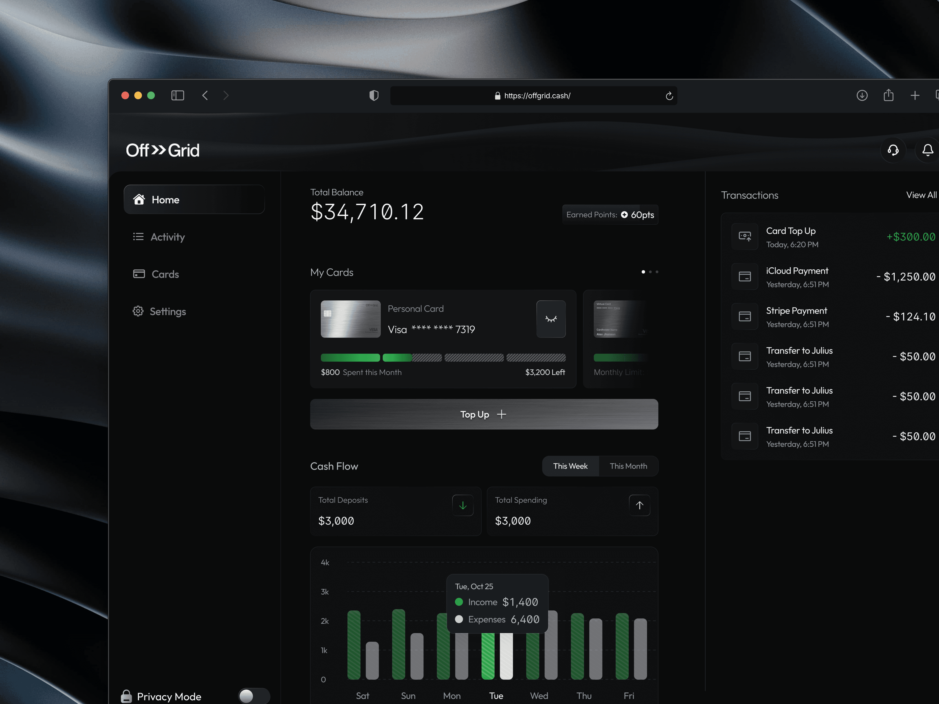
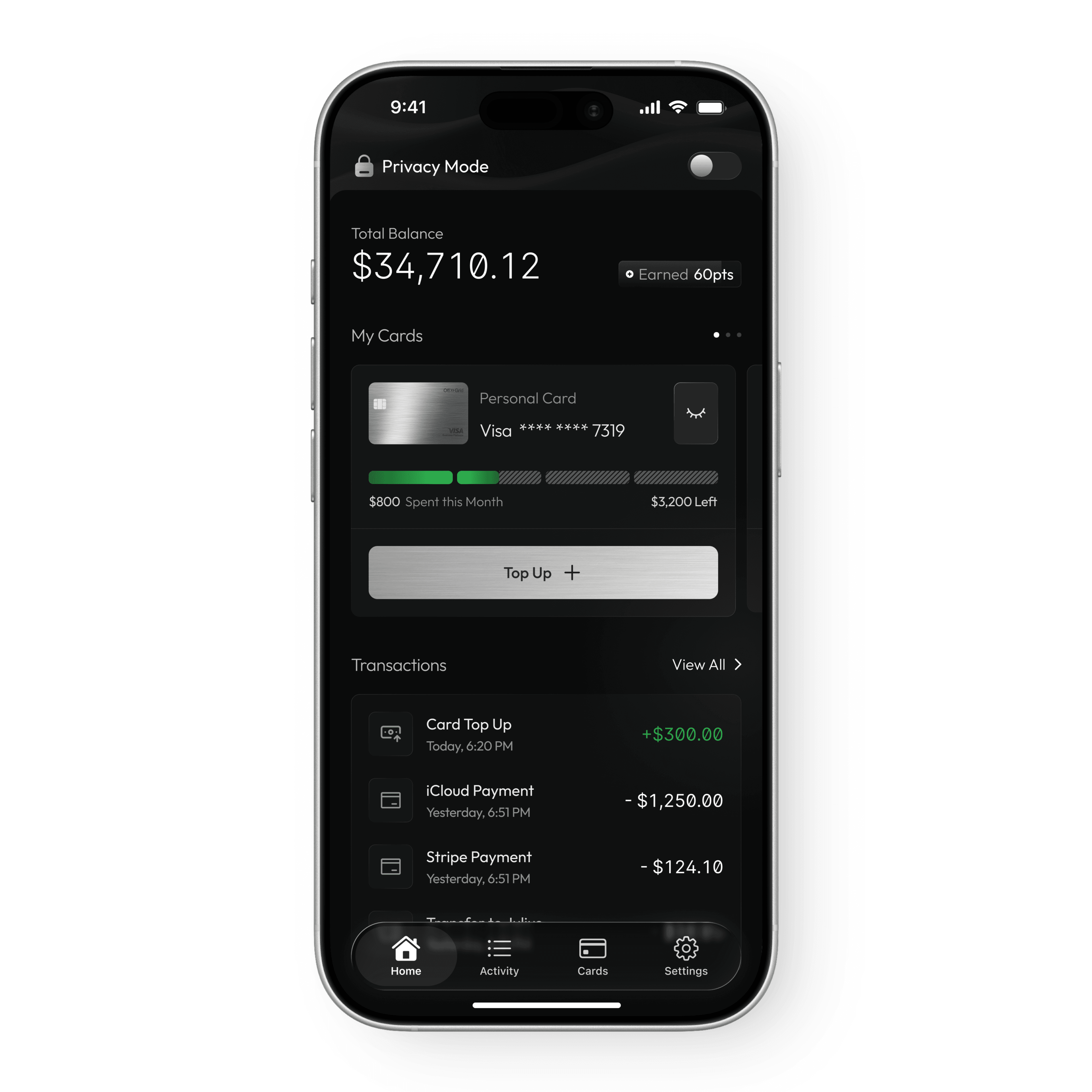
Instead, I focused on clarity and control. The product communicates trust by being transparent and predictable. Users can clearly see their balance, understand their spending, and control how their cards behave. Every action has immediate and understandable feedback. Rather than asking users to trust the system, the design gives them direct control over it.
The Process
A Card-First Experience
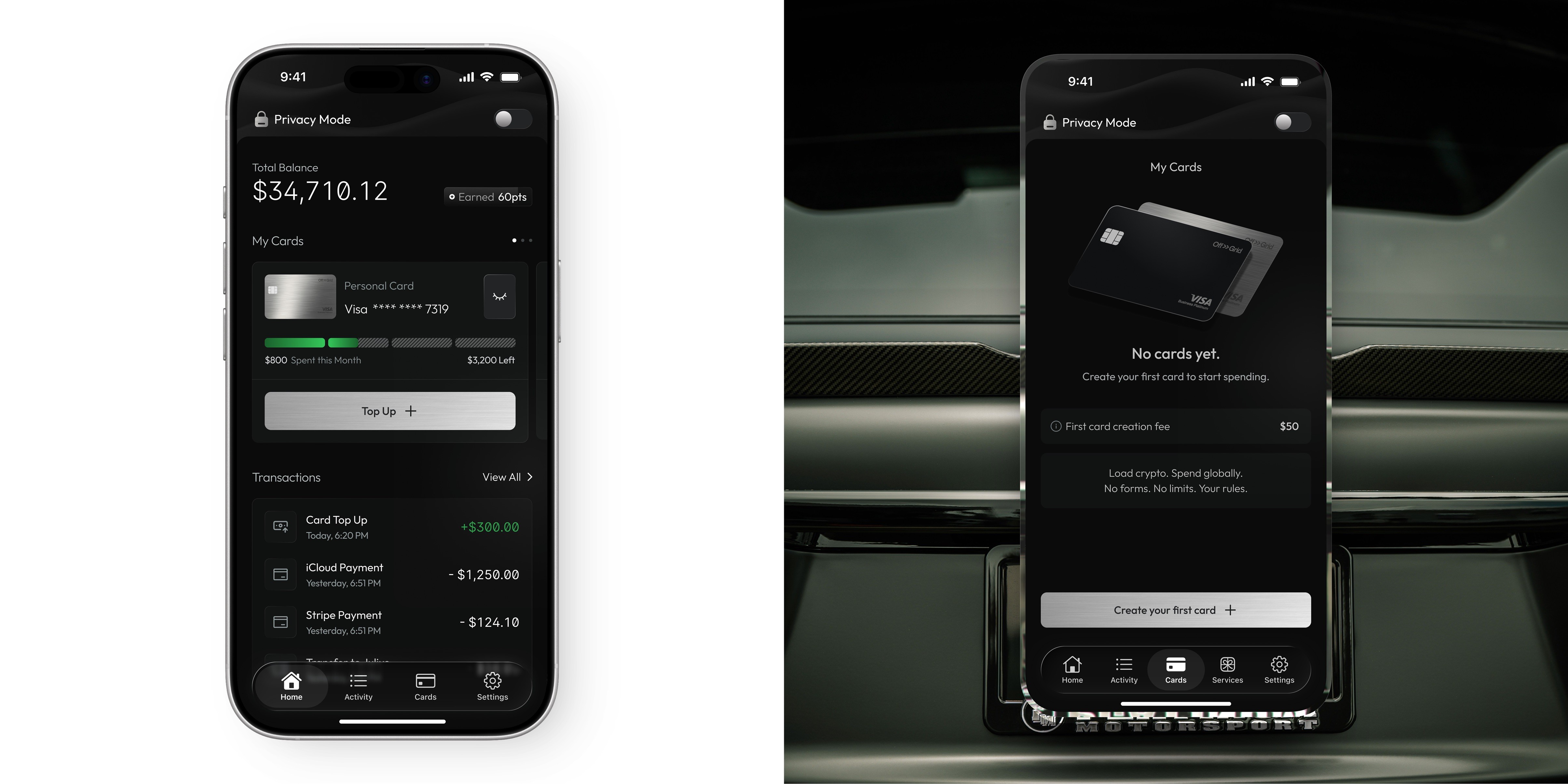
Another key decision was structuring the product around cards instead of accounts. In traditional banking apps, accounts are the foundation and cards are secondary. OffGrid flips this by making cards the primary interaction layer. This approach made the experience feel more tangible and intuitive. Users interact directly with their cards, manage spending through them, and perform actions like top-ups or freezing directly within that context. It simplifies mental models and reduces abstraction, making the product easier to understand.
Design Solution
The Visual Direction
The visual language was designed to reinforce the product’s philosophy. A dark interface was used to convey privacy and focus, while a minimal layout reduced unnecessary noise. Typography was given strong emphasis to ensure financial data remained clear and readable at all times. Subtle textures and surfaces were introduced to create a premium feel without relying on typical fintech aesthetics. The goal was to create something that felt controlled, intentional, and slightly different from mainstream financial products.
Onboarding

Card Creation

Top up your card

Impacts and results
The Outcome
By the end of the project, OffGrid had evolved into a full production-ready design across both mobile and web. The system supports a wide range of user interactions while maintaining consistency and clarity throughout. More importantly, the final product reflects its core idea. It gives users a sense of ownership and control that traditional fintech products often overlook. The experience is not built around compliance or restriction, but around freedom and simplicity.
What I learnt
Reflection
Working on OffGrid reinforced the idea that constraints can lead to better design decisions. Removing identity from the equation forced a deeper focus on usability and clarity. It also highlighted how trust can be built through experience rather than process. The project also demonstrated how quickly scope can evolve when a product begins to take shape. What starts as a small set of screens can become a fully realized system when the underlying idea is strong enough.
